Built for Every Screen
Use your phone, tablet or desktop. The layout fits your screen.
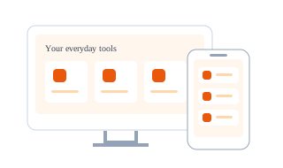
A Layout That Adapts
Columns rearrange for narrower screens, keeping cards and controls within the available width. You do not need a separate mobile app.
A Clear Target to Tap
The complete showcase card is a link, including its preview and surrounding space. Keyboard users can focus it and press Enter to open the same page.
Space Reserved Before Loading
Illustrations have explicit dimensions. Their space is present before image loading finishes, helping the surrounding content stay in place.
Key Security Guarantees
- Changing screen size does not transfer your task to another device.
- These pages add no tracking cookies or cross-device task history.
- Opening the site elsewhere starts a separate browser session; local work is not automatically synced by AllFast.